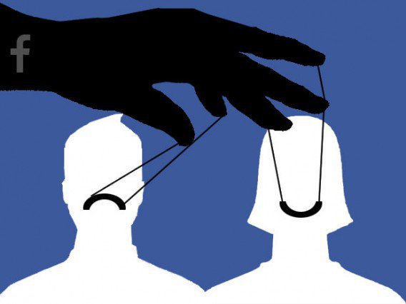
Deception seems to be an accepted part of the online ecosystem. Whatever happened to design that was meant to delight and serve the customer?
Some days ago, I posted about Microsoft’s shenanigans to force people to upgrade their operating system to Windows 10. Over the weekend, I read an account of a colleague’s rant against Twitter’s invasive policies with requiring a cell phone. And yet another person I know shared an article about all the glib things we are supposed to do when attempting to connect to other human beings.
On those recent occasions, I’ve had to think about interactions that we have online, and how much everything has become so slick, that we smell the bait a mile away. As I was pondering all these things, I came across an article which really delves into the matter much more eloquently than I could, given that it’s written by a user experience (UX) expert. The technical term for this deception is “dark patterns.”
It was not so long ago that many companies were investing in employees with graduate psychology degrees in order to help design systems that are effortless in responding to their users’ needs and wants.
There’s hardly any evidence of that these days. Everything is designed to force you into a decision path that caters to the desires of that entity with which you are interacting. Your needs are incidental. As long as they purport to solve that problem, or give the appearance of solving your problem, their job is done. What a travesty.
It would be too easy to blame technology. Rather, I think some marketers have become lazy about earning the privilege of someone’s business. Rather than persuade, they seek to manipulate. Persuasion is not deception; it is noble platform for a battle of ideas, whereby the better ones can win.

